Sweet Izzy’s
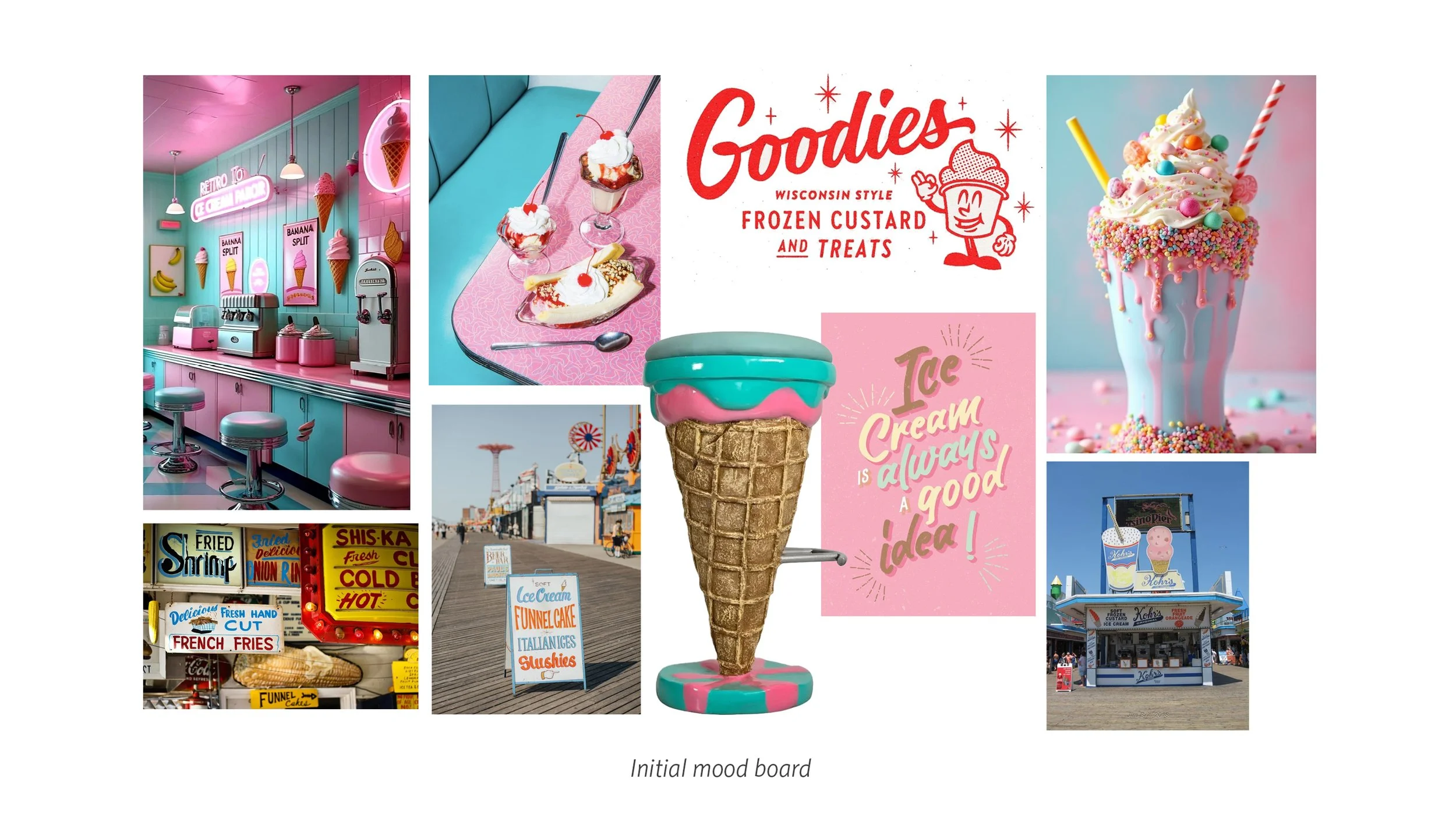
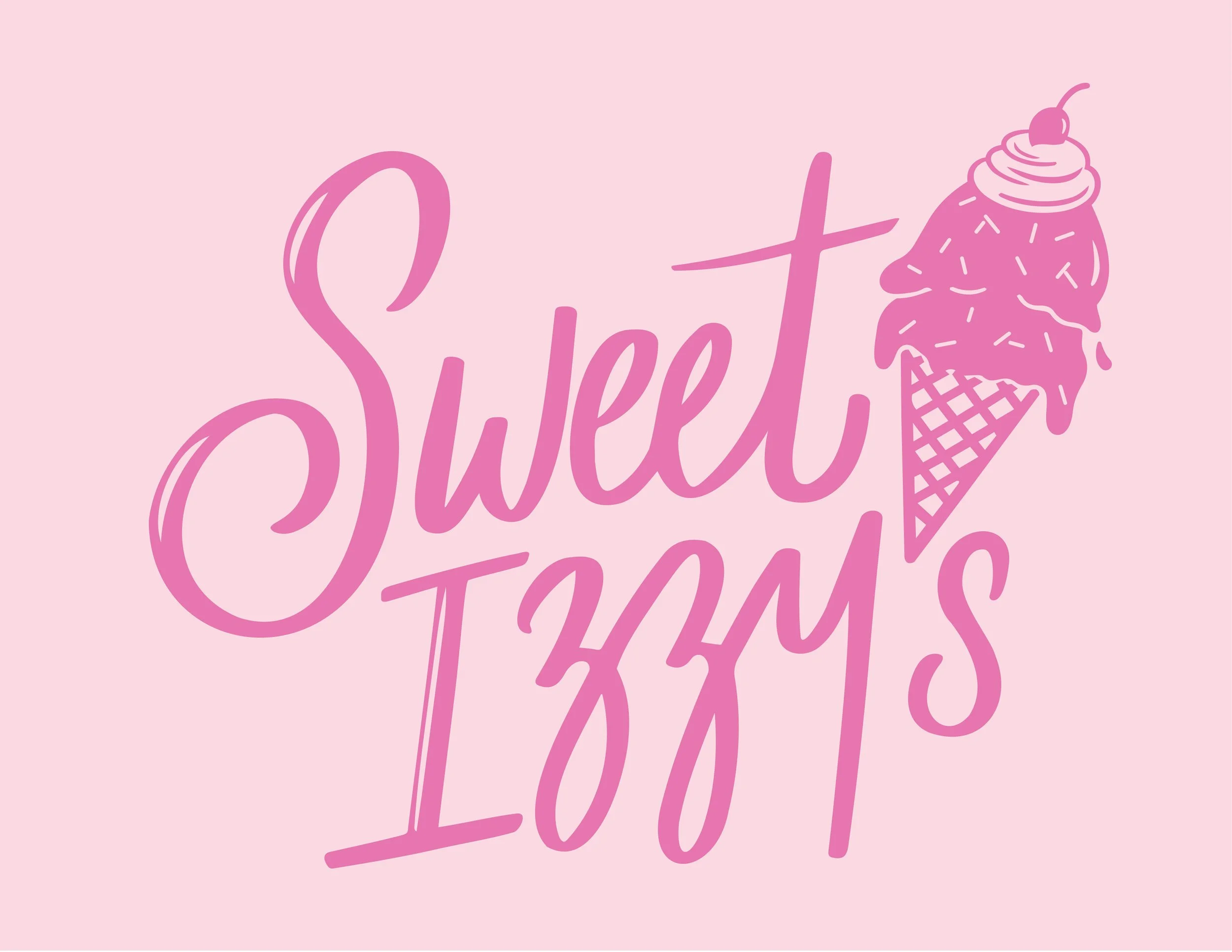
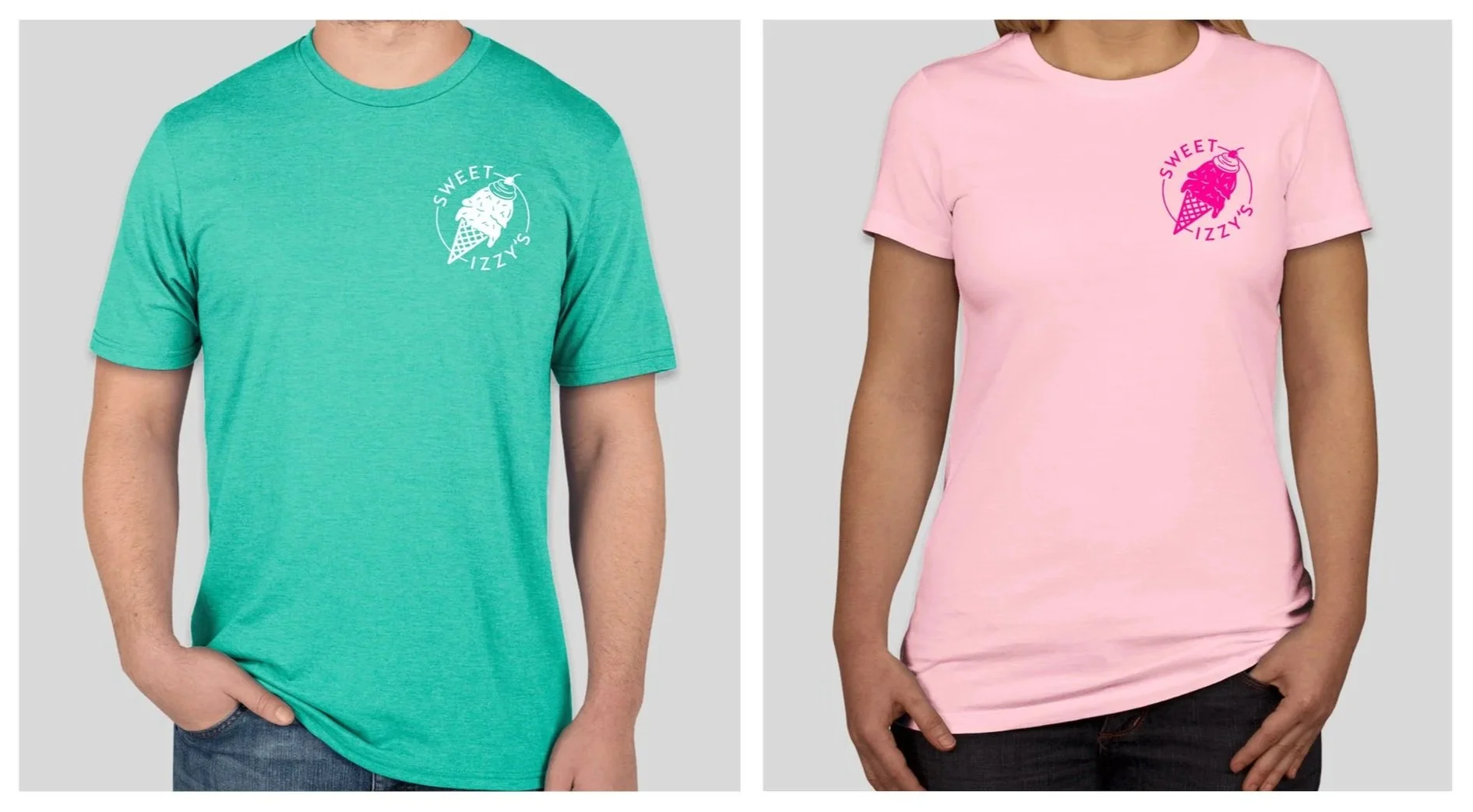
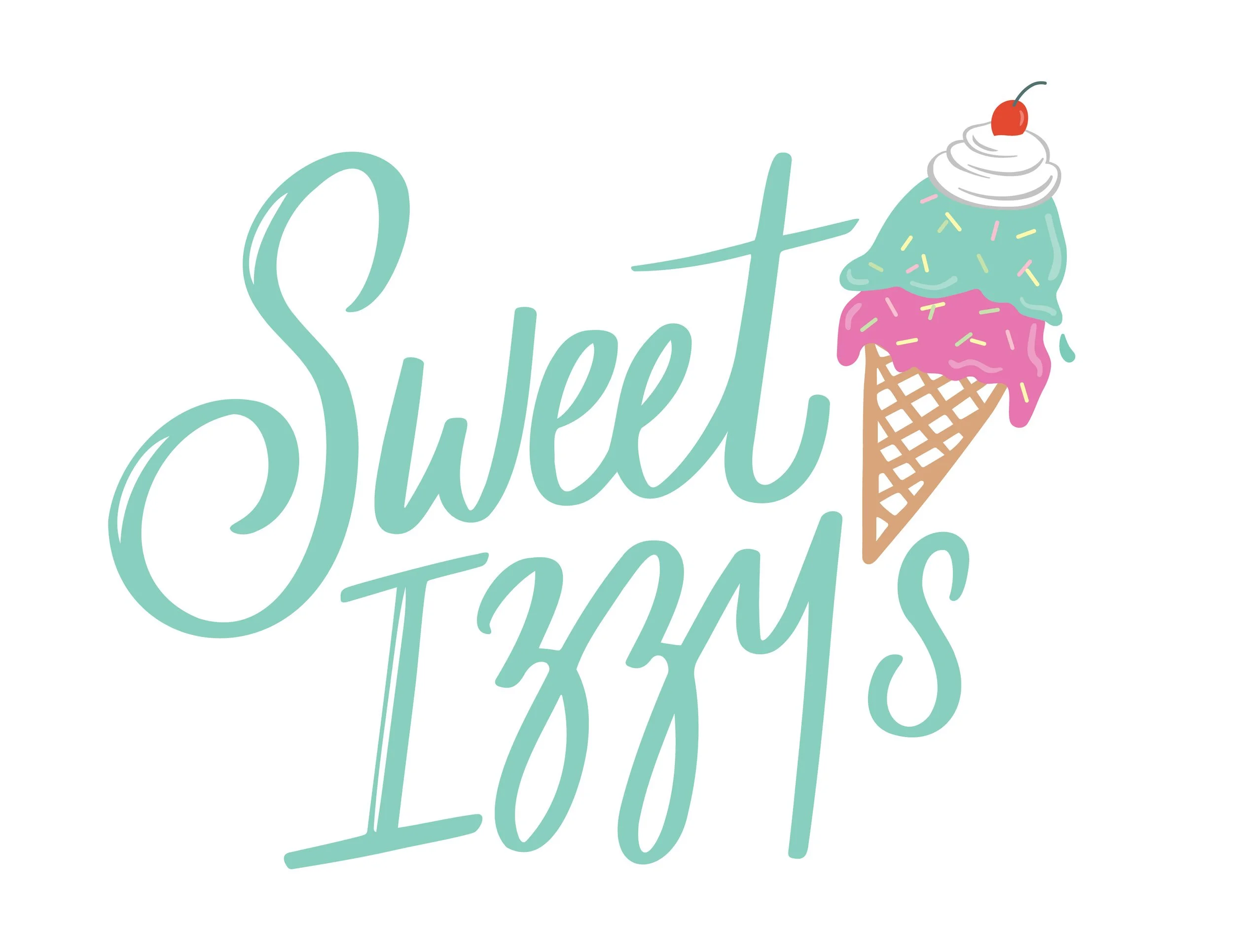
When Rachel Hazan moved to South Carolina from Long Island, NY she immediately noticed something was missing from her small, family-friendly town. Despite the year-round warm temperatures, there wasn’t a single ice cream shop. A natural born entrepreneur, she launched into action to fill the void and less than a year later Sweet Izzy’s was born. The name is a nod to Hazan’s late grandfather, Isidor. Hazan’s vision was clear: old-school ice cream parlor kitsch brought into the 21st century with bright colors and maximalist styling. Her color inspiration—turquoise and hot pink—speaks to her new southern clientele. For typography inspo, Command+N Creative looked to vintage, hand-painted signs from beach boardwalk establishments a la Coney Island and Atlantic City. The result: a logomark with handdrawn lettering in a swirly, drippy cursive. The oversized ice cream cone, complete with whipped cream and a cherry on top, doubles as the apostrophe in “Izzy’s”. To make the logo legible in multiple settings we created several iterations and formats: horizontal, circular, and pared down colorways.
CLIENT
Sweet Izzy’s
INDUSTRY
Food & Hospitality
SERVICES
Brand Identity